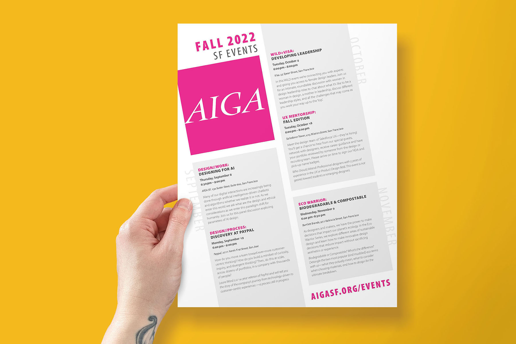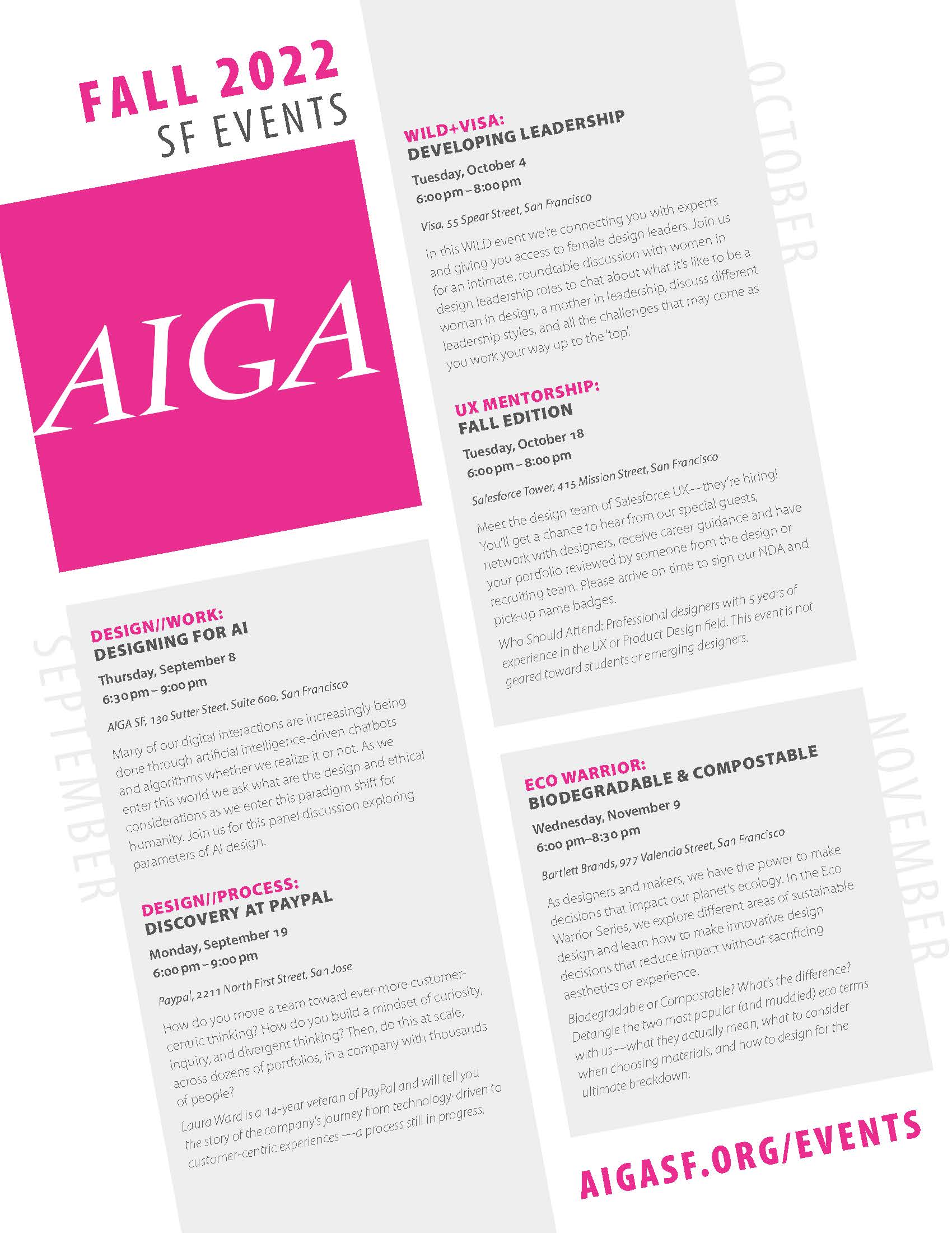
Flier
8.5″ x 11″
With irregular amounts of text and the common calendar format to contend with, in this assignment I first had to establish a clear, consistent hierarchy that would allow readers to easily scan the event info on this one-page flier. Typeface style, leading or spacing, and color were all used within each entry to differentiate and indicate importance.
Of the small selection of allowed typefaces I went with Myriad Pro for its sizable family of options and clear shape contrast to the AIGA letterforms already there.
Since the logomark is boldly simple in and of itself, enlarging it and recoloring to the brand’s magenta quickly catches the viewer’s eye while setting up a comfortable entry point. Tilting it all just enough also sets this sheet apart amid a bulletin board full of other papers.

Product mockup photo: yeven_popov on Freepik
