

Brochure
10″ x 7.3″
Flat double-sided
Two spot color limit
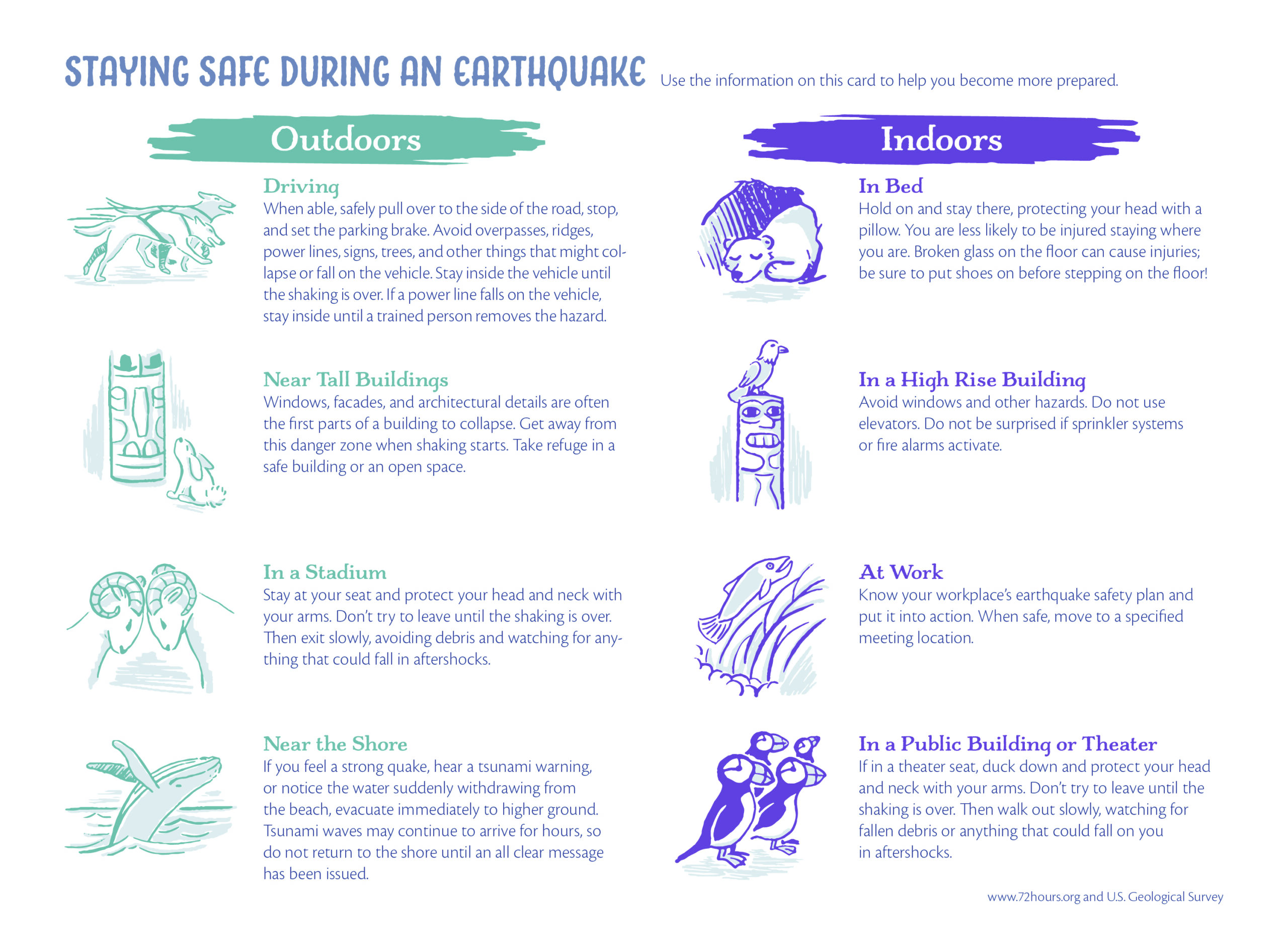
Alaska is an environmentally beautiful state with many destination activities that also endures quite a few earthquakes annually, thanks to its location along the seismic “Ring of Fire.” For these reasons I chose to target the audience of travelers and tourists to the region, who could potentially receive this safety flier at their hotel or on their cruise.
To maintain a light-hearted, friendly mood I created icons depicting Alaskan wildlife to coordinate with each suggested precaution. The tone is further supported with a cool, muted color palette, informal balance, cropping on the front side, and typefaces with a hand-rendered character.
The display face headings are Charcuterie Sans and Charcuterie Serif, both of which have a lightly distressed look and the relaxed ease of a low x-height. Body text was set in Cronos Pro, with its warm Humanist influence and calligraphy pen-inspired strokes, to maintain the personable tone.

Product mockup photo: yeven_popov on Freepik